Roles
Tools Used
Data Visualization, Visual Communication, Social Systems Research
Timeline
Spring 2025
6 weeks
Total Team
Contribution
50 hours
Team
Maria Lucia Benavides
(Individual Project)
Individual
Contribution
50 hours
Figma, Excel, Adobe Illustrator
Overview
This project explores how complex, research-heavy data can be translated into accessible and meaningful visual narratives. Using data from the United Nations’ Report on Progress towards the Sustainable Development Goals (SDGs), I reinterpreted existing charts and tables to make systemic patterns of inequality easier to understand for broader audiences.
Rather than presenting the data as isolated metrics, the project visualizes how failures across education, health, and economic goals reinforce intergenerational cycles of inequality, particularly in the lives of girls in Latin America.
Sustainable Development Goals
The UN Sustainable Development Goals (SDGs) are 17 globally recognized targets adopted in 2015 to address interconnected social, economic, and environmental challenges. For designers, they frame complex multiple-system problems where visualizing systems and relationships is key to understanding impact.
Initial Research
To ground the project in meaningful context, I began by studying the SGDs in depth. I reviewed each goal and its associated targets directly from the UN framework to understand not only what each goal addressed individually, but how they overlapped as interconnected systems.
Through this process, patterns began to emerge. Many goals were not isolated outcomes, but part of broader feedback loops affecting health, education, economic stability, and equity over time. This led to early visualization concepts that aimed to capture multiple goals within a single system rather than representing them as separate indicators.
Early Concept Directions
See Complete System Maps
Investigated how failures across goals compound across generations, shaping the lives of women.
Cycles of Gender Inequality
Examined the evolution of cities toward walkability, accessibility, and environmental sustainability.
Creation of a Utopian City
Explored how environmental conditions, agricultural systems, and urban infrastructure shape food accessibility and nutrition.
From Seed to Plate
Final Concept
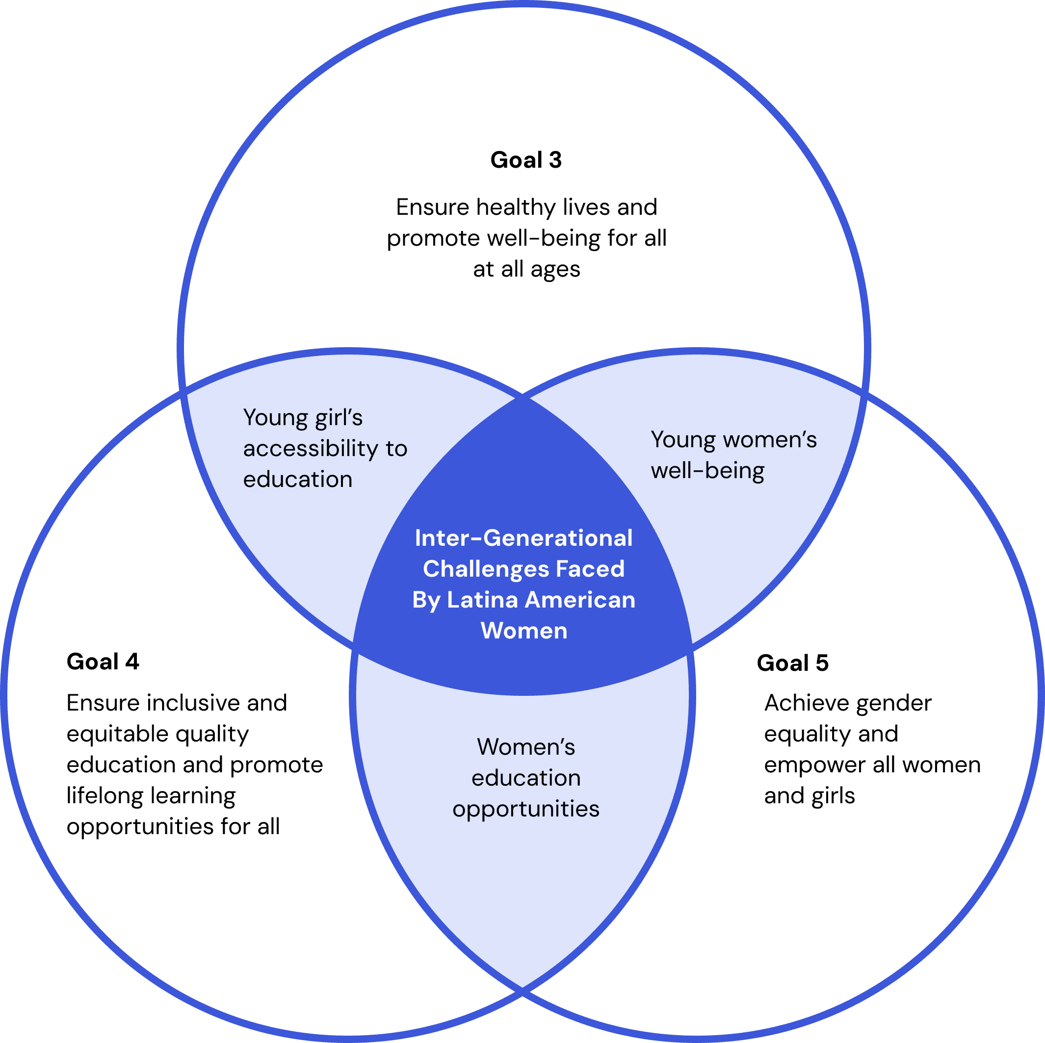
This project draws on a personal connection to Colombia to tell the story of a girl growing up in Latin America through data. It examines how failures to meet certain Sustainable Development Goals create ripple effects that reinforce cycles of inequality, particularly for young women in developing countries.
Limited access to quality education and sexual health resources increases the likelihood of early pregnancy, restricting economic opportunity and long-term stability. By translating key SDG indicators into visual narratives, the work highlights how these interconnected failures repeat across generations, emphasizing the need for systemic change.
Early Concept Directions
To build the project, I began by exploring the Sustainable Development Goals and their indicators—specific data points used by the UN to measure progress within each goal. Rather than treating these indicators in isolation, I looked for patterns across goals that shape everyday life.
Using the SEE-ICE model as a guide, I selected indicators spanning education, health, and economic stability that relate to one another without implying direct causation. Viewed together, these indicators reveal reinforcing patterns of inequality across generations, forming the narrative foundation of the visualization
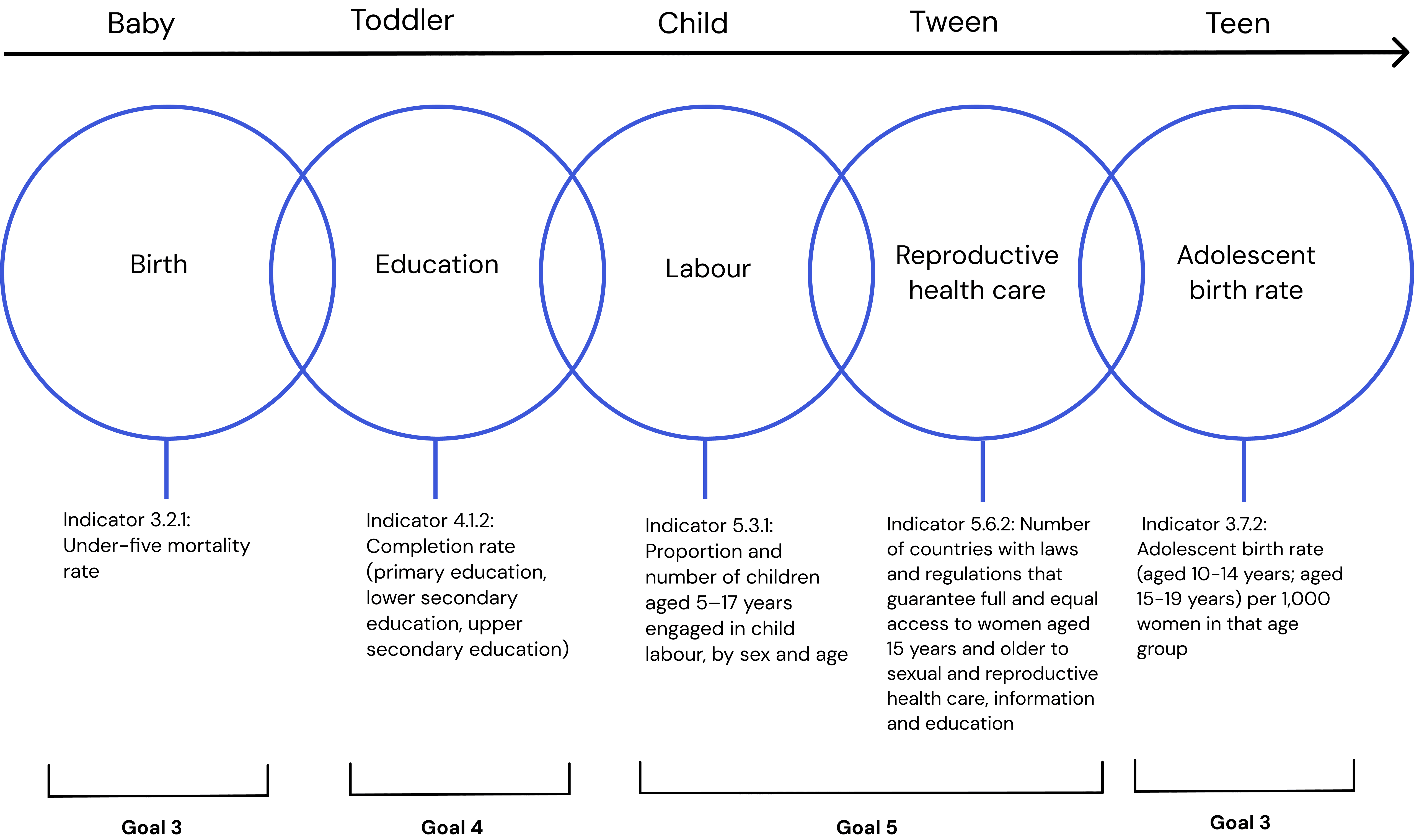
Data Collection
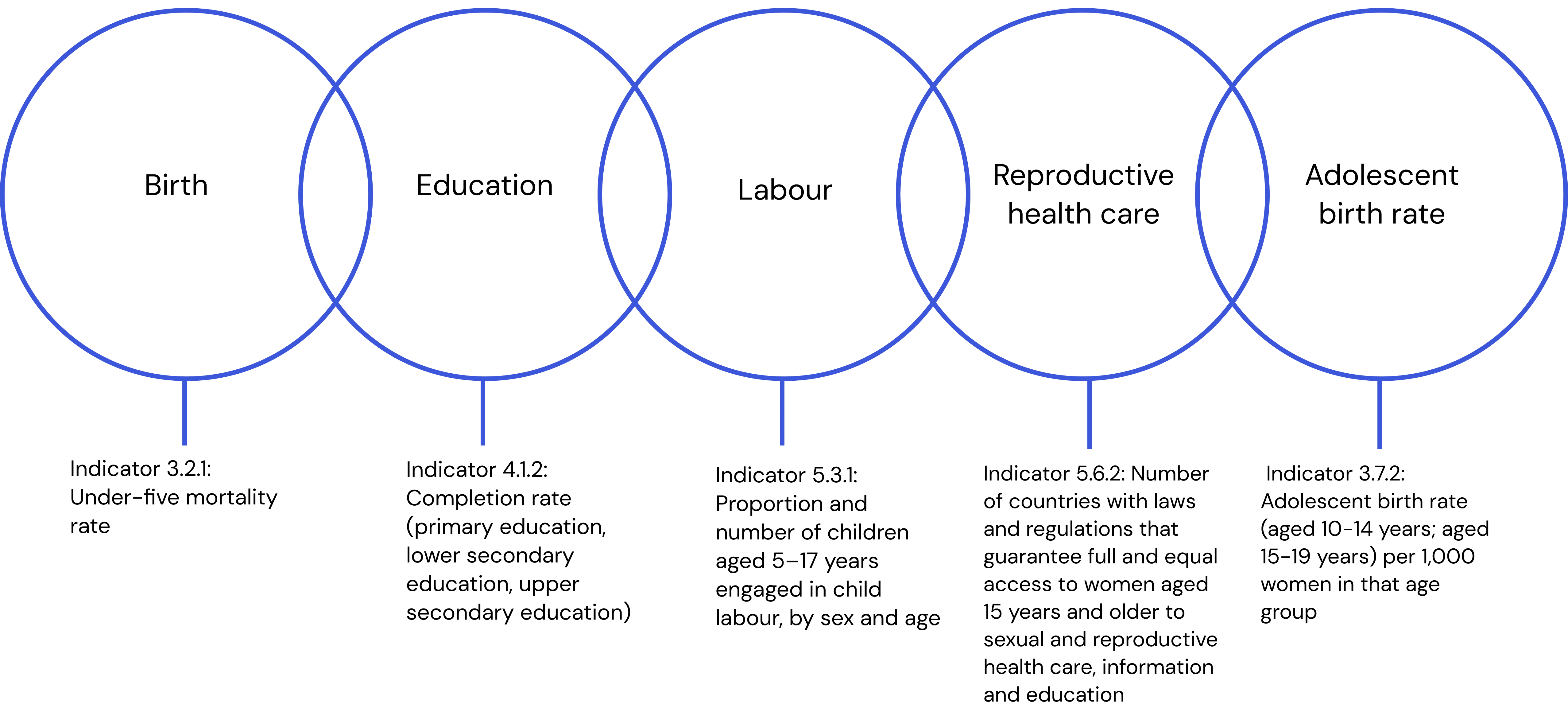
The project focuses on five interconnected issues—birth outcomes, education, labour, reproductive healthcare, and adolescent birth rates. For each step, indicators from adjacent areas were paired and analyzed together to explore how gaps in one domain align with pressures in the next.
Rather than presenting these datasets separately, the data was recombined into new visual relationships, allowing correlations to emerge across stages of life. This cyclical approach reflects how structural inequalities reinforce one another over time, ultimately looping back to affect the next generation.
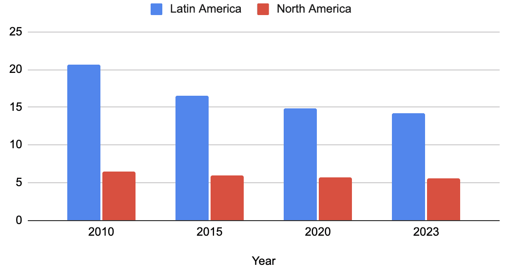
Child mortality vs Education Attainment
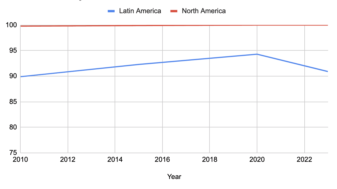
Data was available for both Latin America and North America across the same time period, allowing for a comparative analysis of the two regions. The data was initially graphed individually, then combined into an interactive visualization to explore correlations. Early analysis suggests an inverse relationship: higher child mortality tends to align with lower education completion rates, highlighting systemic disparities between regions
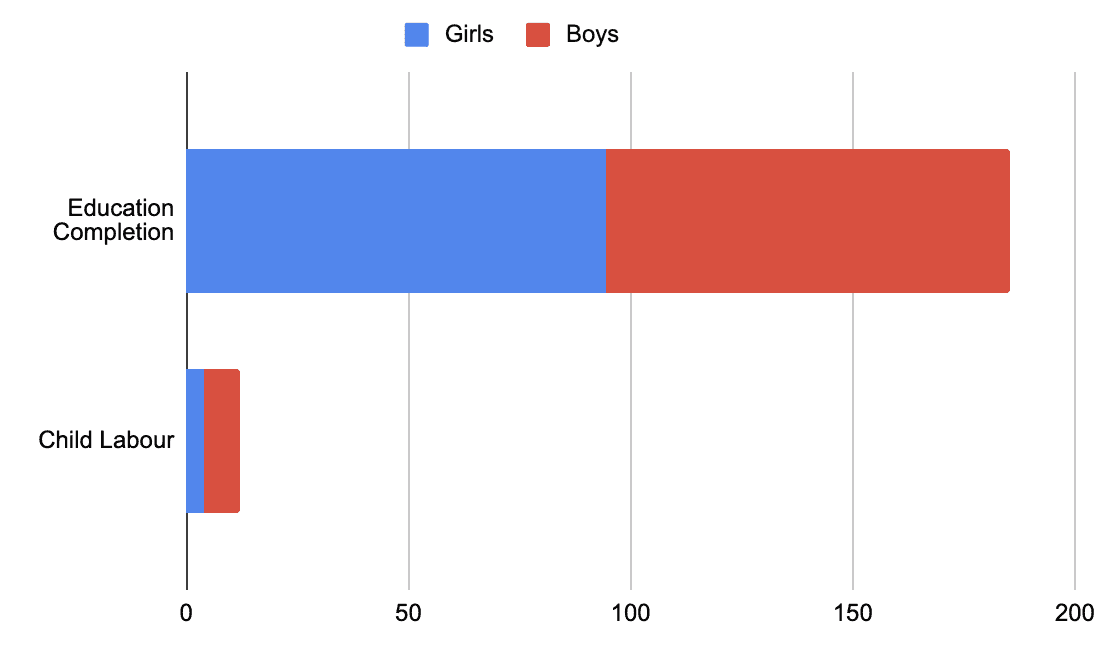
Education Attainment VS Child labour Statistics
With complete data available for 2020, I compared male and female education levels alongside child labour statistics. This analysis explores how disparities in educational attainment correspond to differences in labour participation, highlighting gendered patterns within the workforce.
Child labour Statistics VS Reproductive Health Care
The available data for these indicators came from different years and did not include sex-based comparisons. To address this, I focused on visualizing the percentage of women with access to reproductive health care, translating these percentages into the number of countries in Latin America meeting each threshold. This approach allowed for a clearer, more tangible comparison across the region.


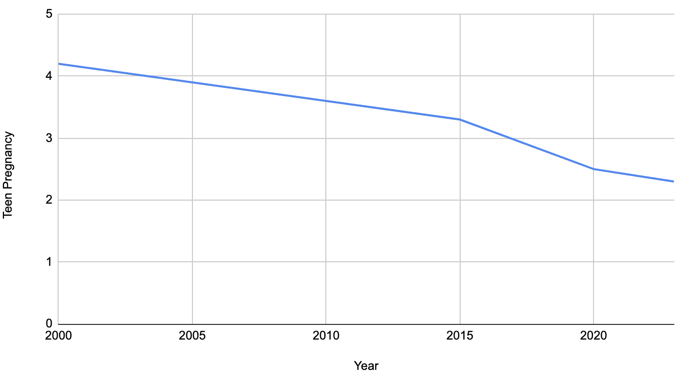
Reproductive Health Care VS Adolescent Birth Rate
The indicators were collected from different years, so a direct comparison was limited. I visualized the rate of teen births over time and contextualized the data by linking it to child labour statistics, using real-world examples from under-resourced Latin American countries, such as Haiti, to illustrate the broader social impact.
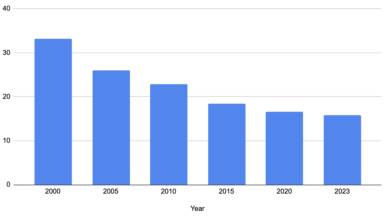
Adolescent Birth Rate VS Child Mortality
To align with the project’s design concept, I visualized under-five mortality using bar graphs resembling stems and adolescent birth rates using five-petaled flower icons for each year. This approach highlights the correlation between the two indicators, showing how increases in adolescent birth rates correspond with higher child mortality.
Design System
The visualization explores girlhood in Latin America, combining SDG data with lived experiences. After exploring multiple drafts, the final design system presents a nuanced, research-informed representation of womanhood that moves beyond conventional “pink and girly” aesthetics.
Typography
Crimson Pro
The typography was chosen to unify the visual system while remaining highly readable and accessible. Despite being a serif font, it features rounded edges and organic forms, which complement the pastel colour palette.
Colour Palette
#FBE16C
#FCD278
#3159DF
#F7A38D
#F16F9B
Early drafts used pink as a shorthand for femininity, but this felt reductive. The final palette reworks pink into a warmer tone rooted in the cultural and climatic context of Latin America, expanded with additional warm hues to create a more nuanced and meaningful representation of girlhood.
Design Elements
The central visual element of the project is a layered flower, chosen for its symbolic and cultural resonance.
Flowers are deeply rooted in Hispanic literature and tradition, symbolizing resilience and womanhood. They honour the strength of underrepresented women.
Cultural Context
Flowers are commonly associated with femininity, allowing the design to express softness and care without relying on stereotypical visual tropes.
Femininity
The visualization explores inequality as a repeating, intergenerational cycle. Flowers represent continuous processes of growth, decay, and renewal.
Cycles of Life

Final Prototype
An automated platform that provides personalized coaching to help users manage their spending and savings responsibly.
The Solution
See Complete Contextual Research
This project visualizes the interconnected challenges shaping the lives of women in Latin America, showing how gaps in education, labor rights, reproductive healthcare, and economic opportunity reinforce cycles of inequality. By translating complex data into visual narratives, the work makes these systemic relationships more accessible and underscores the need for structural change.

Breaking cycles through design
Analyzing interconnected SDG data allowed me to surface the generational cycles of inequality affecting women. By mapping these relationships, I could make structural disparities visible and actionable, showing how gaps in opportunities reinforce one another over time.
Systems-oriented visualization
Working with multiple, interrelated indicators required a systems-thinking approach to synthesize complex social data into coherent visual narratives. This process strengthened my ability to translate datasets into structured frameworks that reveal patterns across time, space, and demographic groups.
Ethical and culturally-informed design
Designing for sensitive topics demands careful consideration of cultural context, heritage, and gender dynamics. Decisions about color, symbolism, and framing were guided by research and personal experience, ensuring the visualization respected its subjects while effectively communicating.