
Roles
Tools Used
Ideation, UX Research,
UI Design, Prototyping
Timeline
Winter 2026
6 weeks
Individual
Contribution
60 hours
Figma, Illustrator, UXTweak, Miro,
Gemini
The Problem
There is a gap in the book collection app market that ignores the emotional connection and personal preferences users apply to their collection habits.
Preliminary Research
Books Collector Tools
Digital
Book collectors sometimes rely on digital book cataloguing services, these are usually apps or websites that create book lists based on barcode scans.
General Audience
The beginner/casual book collector usually uses tools that many readers use such a bookmarks, reading lights and organizational tools such as bookshelfs and drawers.
Advanced Collector
More advanced book collectors frequently use conservation tools such as dust brushes, protected displays and gloves, as well as more advanced digital databases.
Canadian Reading Habits
of Canadians read or listened to books weekly in 2023. 59% of them prefer print books most.
49%
of Canadian readers spent between $100 and $149 on print booksper month
1/3
of Canadians discover new books through social media platforms. It is the 3rd most used discovery method.
22%
Missing Features
Lacks essential features for readers such as a Did Not Finish (DNF) option.
Poor Navigation System
Apps like Goodreads have very limited filters and fails to locate books.
Lacks Personalization
Book collecting habits vary between user which requires customization.
Pain Points in Existing Book Apps
To build up a library is to create a life. It's never just a random collection of books”
— Carlos María Domínguez
“
A personalized digital cataloging and organization app designed specifically for book collectors
The Solution

Collector Interview
Context & Setup
Before jumping into competitive analysis or design, I wanted to ground this project in a real collector's world. I reached out to someone with a collection of hundreds of books who had never used a book tracking or cataloguing app, which made them an ideal window into how passionate collectors naturally organize their books.
First Impressions
This was an observational visit where I photographed their collection, asked questions, and documented how they think about their books. What stood out immediately was that their organization system which followed a self-developed structure that combined personal significance, the purpose of each book, and the convenience of its location.
Findings
Tracking is entirely mental
Despite owning hundreds of books, they rely solely on memory to keep track of what they own, have read, and want to read. They said it was "a system that works until it doesn't."
Uniqueness is their core value
What makes their collection meaningful isn't the quantity but the individuality of each piece. Handmade books, unique editions, and books with personal history are the most valuable. The absence of a way to document these unique pieces is what has kept this collector from adopting any app at all.
Location is an overlooked organizational layer
Perhaps the most surprising finding was how much physical space shapes organization. Without a dedicated library room, location becomes a functional category: currently reading books live on the nightstand, academic and work books in the study, rarely touched books on hard-to-reach shelves, and aesthetically loved books in visible, prominent spots. Organization isn't just about genre or author, it's about daily life and physical access.
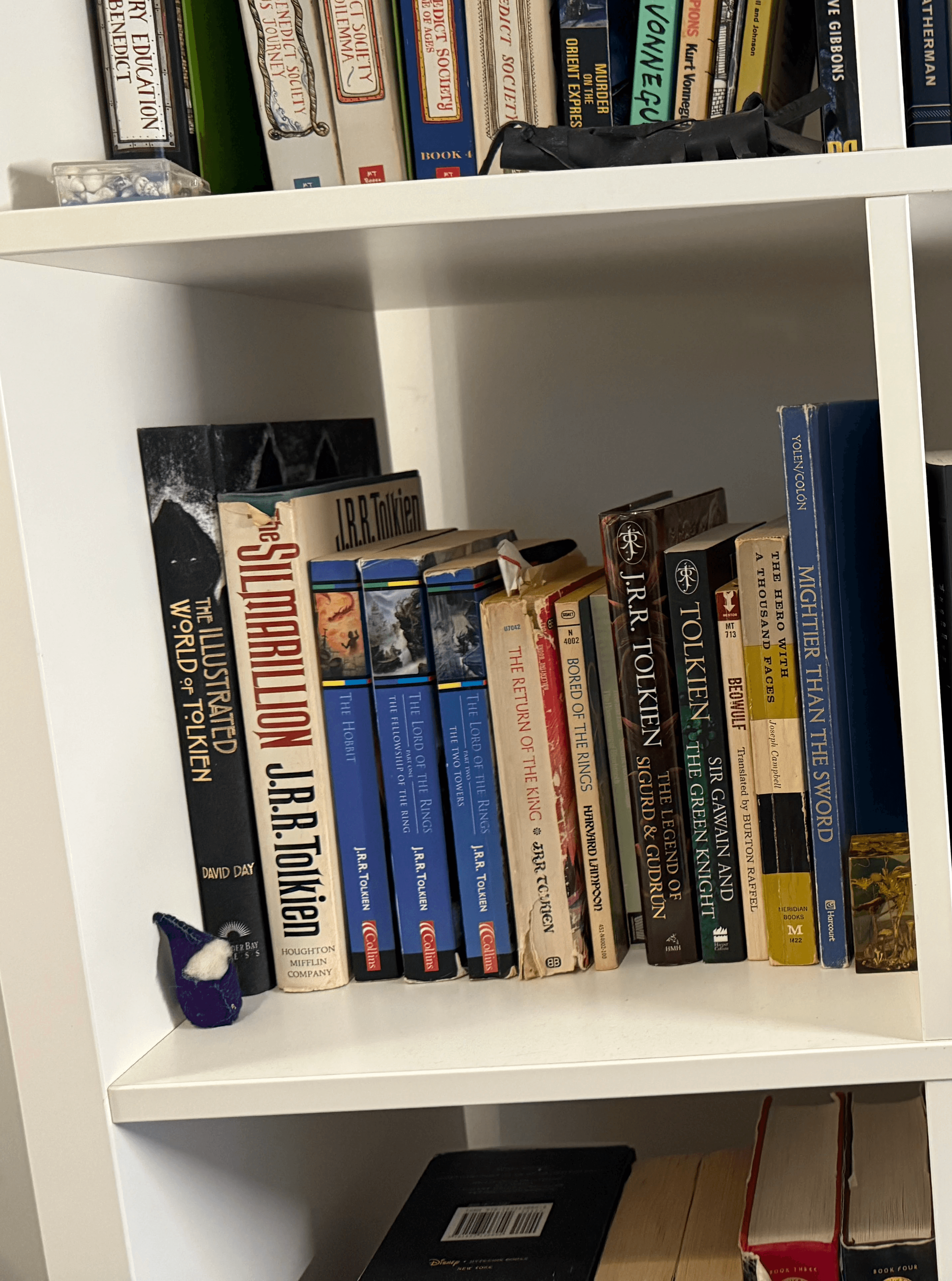
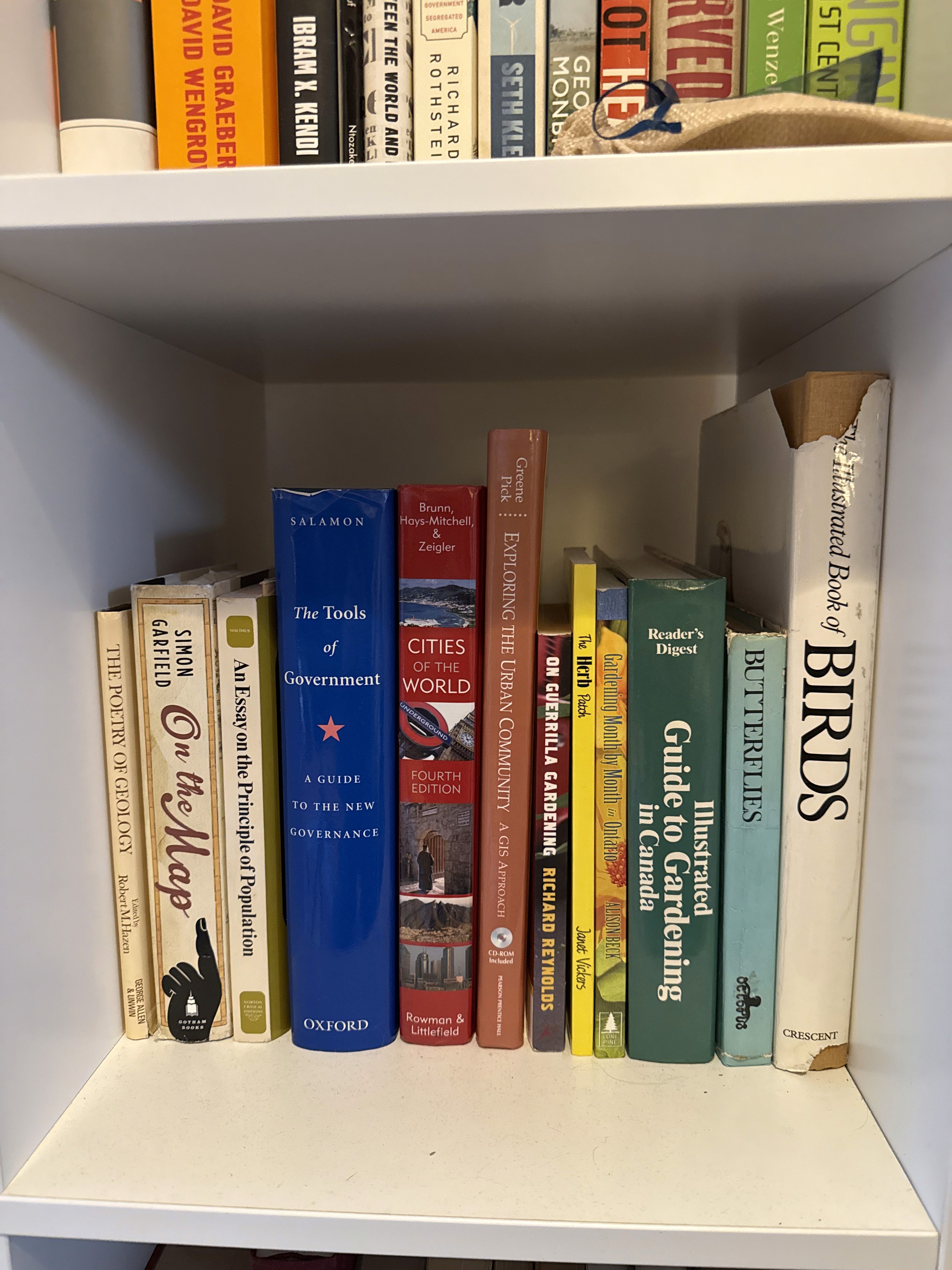
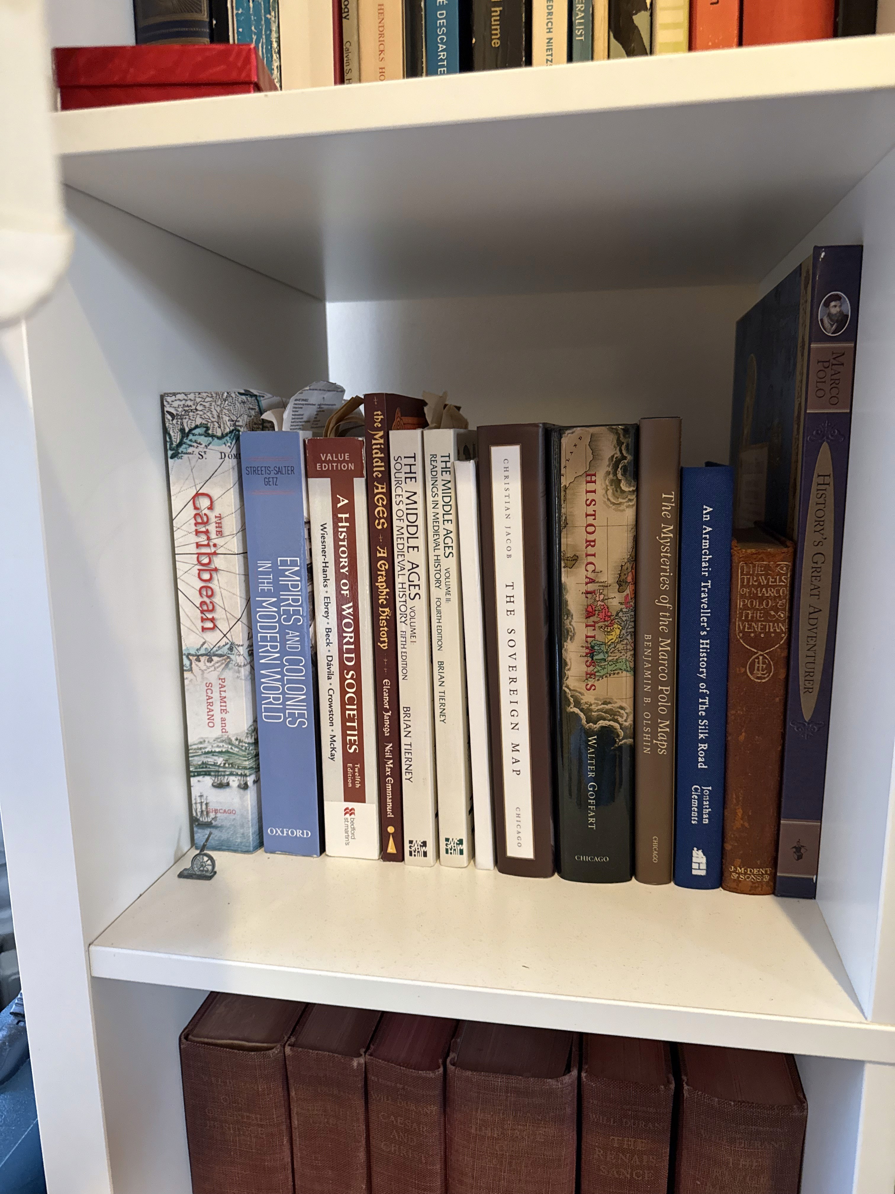
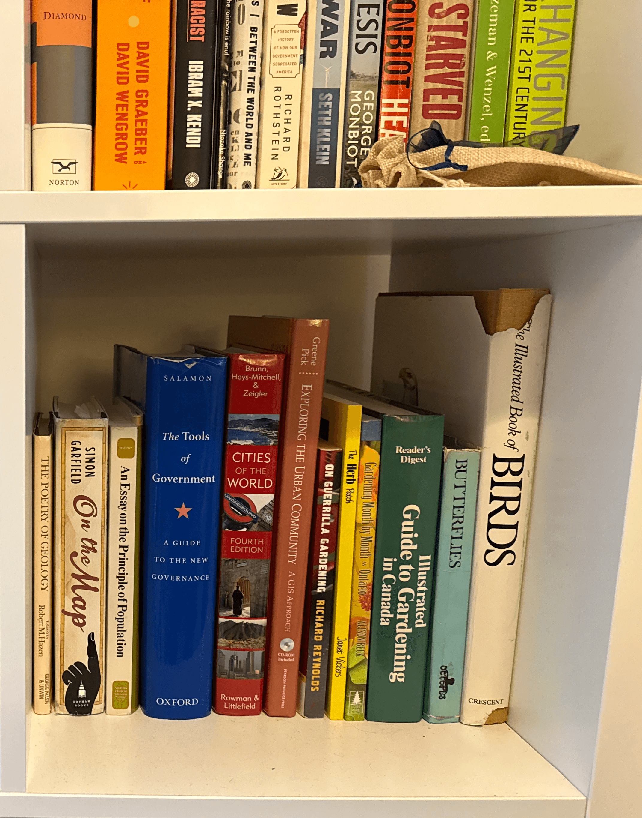
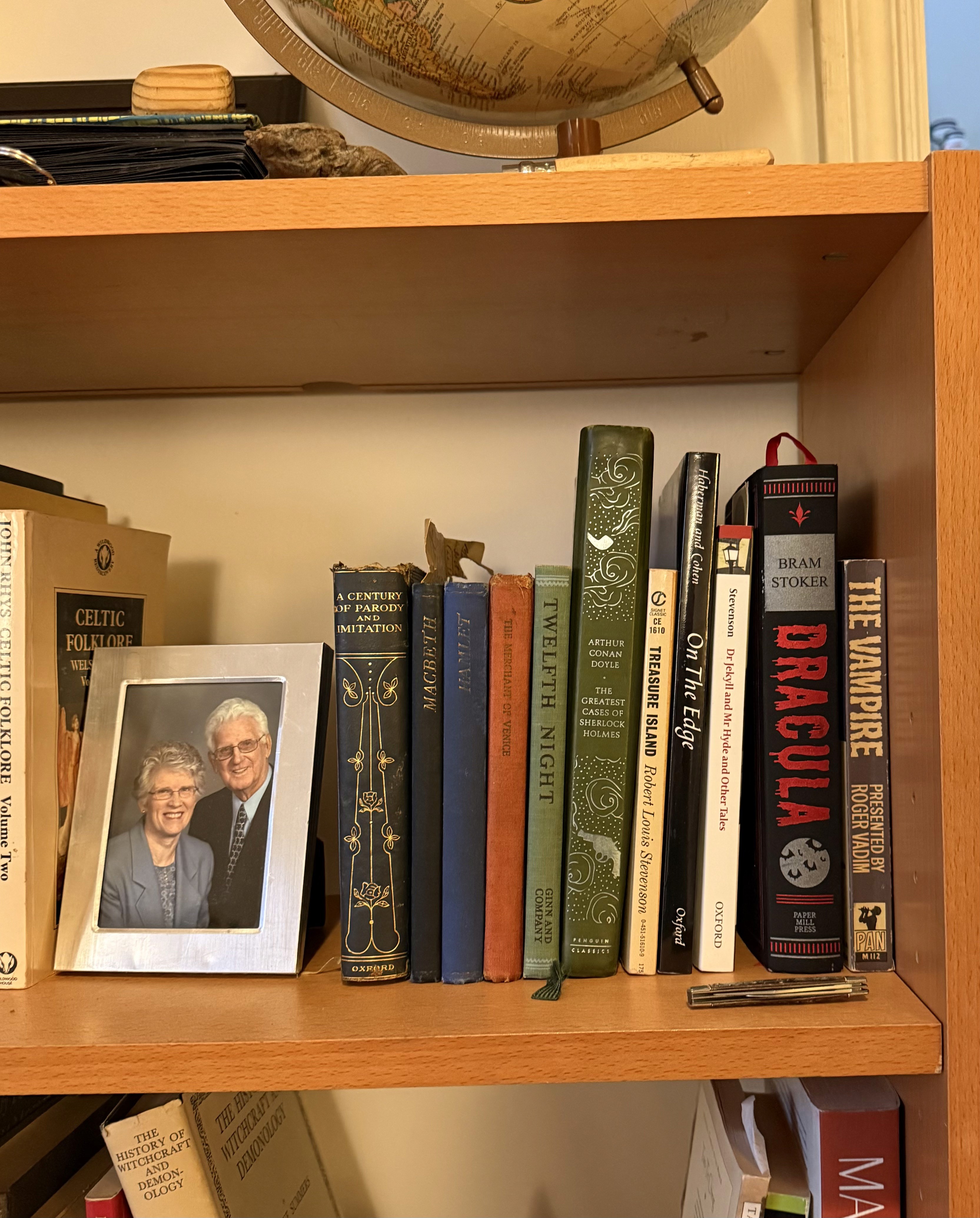
Takeaway
Existing apps fail collectors because they treat books as data points rather than objects with history, meaning, and physical presence. Any meaningful solution needs to account for uniqueness, personal significance, and the spatial reality of how people actually live with their books.
Goodreads
A free website/app that functions as a social network and allows readers to discover, rate, review, and track books.
The interface feels dated and unintuitive, with confusing navigation and a lacking filtering system which makes it difficult to search items.
Usability
Hosts an extensive book database, but frequent duplicate entries makes books harder to find and share reliably.
Content
Despite being a pioneer in social reading, Goodreads has introduced little meaningful innovation over the years.
Novelty
The app is prone to crashes, particularly mid-review, creating user frustration.
Technology
the recommendation system is impersonal and the categories they publish feel generic.
Functionality
The visual design is noticeably outdated, with a cluttered layout that feels unpolished compared to modern app standards.
Visual Design
Other Competitors

See Full Benchmark Analysis
Benchmark Analysis
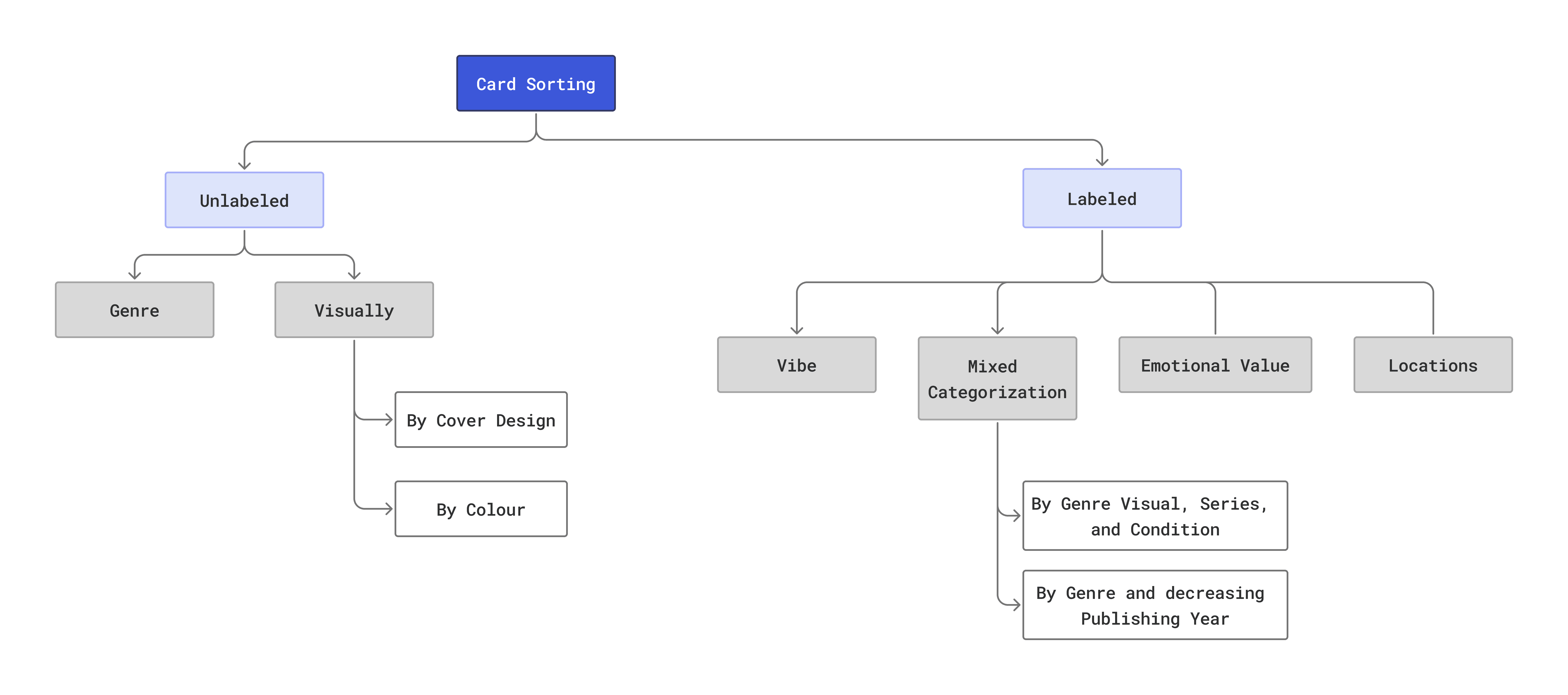
Card Sorting
Methodology
To understand how users naturally categorize books, I conducted two card sorting exercises with 6 participants (the maximum allowed for this study.)
Each participant was presented with 20 cards and completed both an unlabeled and a labeled sort. In the unlabeled exercise, participants sorted cards based on imagery alone, revealing their instinctive organizational instincts without any influence. In the labeled exercise, cards were enriched with contextual details drawn from the current information environment as well as personal attributes:
Genre
Year Published
Reading State
Reason for Owning
Frequency of Use
Emotional Value
This two-step approach allowed me to compare how users organize books visually versus how they organize them when given richer, more meaningful context, directly informing the app's information architecture.
Findings
Similarities
Visual organization came naturally, as 60% of participants sorted books visually in the unlabeled exercise.
Even when provided with detailed attributes in the labeled exercise, 80% of participants disregarded the suggested categories and created their own (suggesting that book organization is deeply personal and resistant to imposed structures.)
Differences
Only 1 participant merged different types of categories together, while the majority kept their organizational systems siloed. And participants rarely created a secondary layer of organization beneath their primary groupings.
Granularity varied widely. Users approached specificity very differently — some created a few broad umbrella categories while others broke their collections down into many narrow, specific ones.
User Personas

Sofia has been collecting books since her teens. Her collection has grown to over 200 books spread across her apartment. Each book means something to her, and she specially loves a comfort re-read. She's never found an app that feels worthy of her collection.
Sofia M.
Graphic Designer, 28 years old
Pain Points
Relying on memory becomes unreliable as her collection grows
Existing apps have no way to capture what makes a book special or unique
No app accounts for location as an organizational layer
Duplicate database entries make adding books frustrating and unreliable
Traits
Visually driven
Sentimental
Curious
Self-sufficient
Scenario
"
— Sofia M.
I've tried a few apps but they all feel like they were made for someone who just wants to track how many books they've read. My collection is more than that."
Needs
To quickly locate a specific book within her home
Browse her collection by mood
A way to document unique/handmade editions
See All User Personas and Scenarios
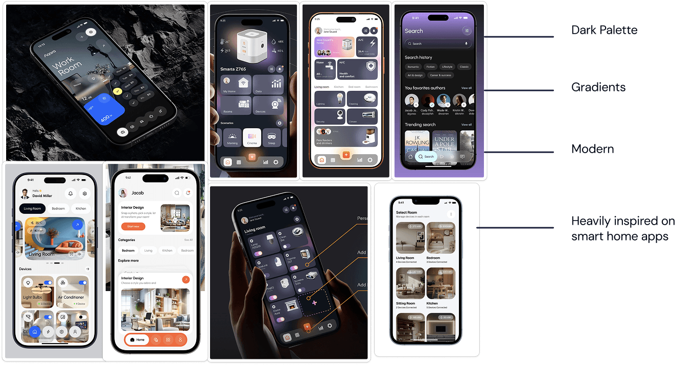
Visual Research
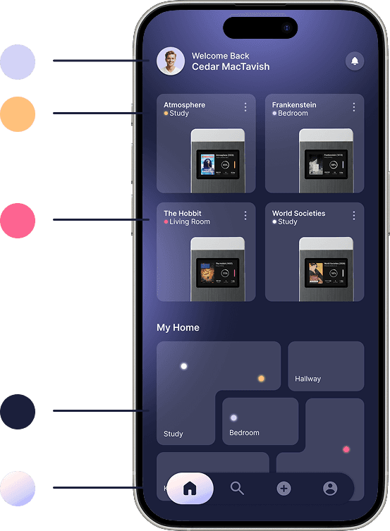
For the visual direction I wanted the app to feel functional without being cold. I was drawn to dark colour palettes softened by gradients, creating a sense of depth and coziness.
Unexpectedly, a lot of my inspiration came from smart home apps. On the surface they seem unrelated, but the parallels are strong: both need to organize information by physical space, both need to feel intuitive and personal, and both are apps you live with rather than just use. That sense of belonging and familiarity was something I wanted to carry into the visual language of this app.
See Complete Visual Research

Specificity over scope
Designing for a broad market can make the problem feel unattainable. In future projects I'd define narrower, more concrete goals from the start to keep the solution focused and achievable.
Research will surprise you
I came into this project assuming the solution was straightforward… it wasn't. Talking to real users completely reshaped my understanding of the problem and reminded me to lead with curiosity rather than assumptions.
Collaboration strengthens ideas
I'm most proud of my ability to take nuanced, sometimes contradictory findings and translate them into concrete, intentional app features. It really showed me the importance of closing the gap between insight and design decision.
Key Takeaways